Sample Applications
To demonstrate the possibilites and features implemented in IntegralUI controls and components, you can download and test the following sample applications. Each sample is provided as a stand alone executable so it can be easily downloaded and tested. All samples are included with our products and are provided with complete source code. Each sample comes in two versions, C# and VB.NET.
| Sample applications | Size | Download |
|---|---|---|
TabControl with Nested Tabs |
||
| An example on how to create TabControl where each tab can contain child tabs shown under its parent tab. Ability to nest tab pages inside other tab pages in TabControl .NET. | 599 KB |  |
Hide or Disable Tab Pages in TabControl |
||
| Demonstrates how to hide or disable tab headers of pages in TabControl .NET. | 594 KB |  |
AutoSize Column Width in ListView |
||
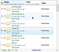
| Shows how to resize column width automatically to fit its content in ListView .NET. Click on column header edge to autofit its width or use autosize methods from code. | 572 KB |  |
How to Increase Space Between Items in ListBox .NET |
||
| Demonstrates how to add space between items in ListBox .NET control using spacing, margin and padding. | 479 KB |  |
Columns with Fixed Width in ListView .NET |
||
| An example on how to fix column width and how to make some columns locked to the left or right side in ListView .NET control. | 572 KB |  |
How to Add a Close Button to Tabs in TabControl |
||
| An example showing how to add a close button to each tab header on your TabControl .NET, WinForms. | 473 KB |  |
Expand Node on Hover or by Clicking on Node's Text in TreeView .NET |
||
| Demonstrates how to expand or collapse a node while mouse cursor hovers over its space or when node’s text is clicked in TreeView .NET control, WinForms. | 509 KB |  |
Splitter with Expand/Collapse Buttons |
||
| Learn how to create a splitter with custom expand and collapse buttons and how to change orientation of splitter in SplitContainer .NET control. | 438 KB |  |
How to Create Items with Rich Content Using ListBox .NET |
||
| An example showing how to create item with rich content using various objects like text, images, hyperlinks and custom controls in ListBox .NET control and arrange them in custom layouts. | 471 KB |  |
Increase Space Between Columns in ListView |
||
| An example showing how to increase space between columns in ListView .NET control, and how to adjust the column width to fill remaining area. | 574 KB |  |
Show Ellipsis for Tabs with Longer Text in TabControl |
||
| Learn how to limit tab width by showing ellipses at the end of text in longer tabs in TabControl .NET. Also shows tabs in auto sized, compressed and justified display mode. | 492 KB |  |
In-Place Text Editing of SubItems in TreeListView |
||
| Learn how to use different in place editors to edit the label of subitems in TreeListView .NET control. The article explains the use of LabelEdit and TextControl as in place text editor. | 564 KB |  |
Load Data on Demand from XML File in TreeView |
||
| An example on how to load data on demand and populate the TreeView .NET control using partial or full data serialization from/to XML files. | 506 KB |  |
Explorer |
||
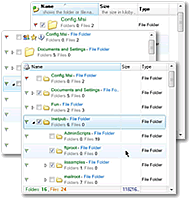
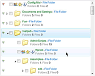
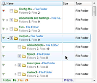
| Demonstrates how to create an application similar to Windows Explorer, using IntegralUI Lists controls. | 547 KB |  |
Custom Catalog |
||
| An example on how to create a custom catalog by creating items with rich content using HTML tags in IntegralUI ListBox control. | 568 KB |  |
Messenger |
||
| Shows how to cerate expand items with additional content in IntegralUI ListBox control. | 396 KB |  |
TreeListView with Custom Embedded Controls |
||
| Demonstrates how custom controls can be included in IntegralUI TreeListView. Data is presented in advanced detail view with fixed columns to the left and right side, with several types of custom controls. | 254 KB |  |
Image Scaling in ListView |
||
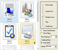
| See how images or icons of your files displayed with IntegralUI ListView can be rezised just by moving the size control slider. Displaying checkboxes and flags, as well as Office 2007 fading effect is also available for demonstration. | 1.2 MB |  |
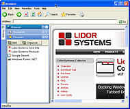
Browser |
||
| Implementation of Collector controls in simple web browser-enabled application. It enables you to switch between five visual styles and theme-aware option included as standard features of the control, to show how the control will change the appearance based on the operating system or system scheme you have on your PC. | 449 KB |  |
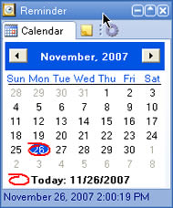
Reminder |
||
| A nice example how Collector can be used to create small, compact application, which can be displayed on your desktop without taking much space. It includes Calendar, Notes and Launcher tabs, along with very convenient Expand/Collapse button. Five visual styles and theme aware option are enabled, to show how the control will change the appearance based on the operating system or system scheme you have on your PC. | 309 KB |  |
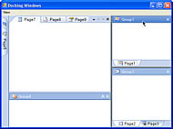
Docking Windows |
||
| Explore the full power of Lidor Systems Collector docking capabilities. This sample application has advanced layout which demonstrates the variety of options for docking, floating, documents and tool windows, hiding/showing and expanding/collapsing windows. Standard five visual styles and theme aware option are enabled. | 336 KB |  |
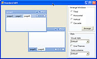
Standard MDI |
||
| This sample application gives a look at Standard MDI feature, which provides document interface in which windows can be tiled, cascaded or minimized. Typical example of real application is Microsoft Excel. Standard five visual styles, theme aware option and color scheme selection are enabled. | 300 KB |  |
Tabbed MDI |
||
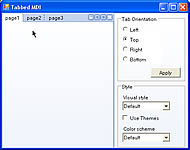
| Example of united possibilities of TabControl and Tabbed MDI included in the .NET framework, in one comprehensive control. It offer customized rendering, tab alignment on any side, reordering with drag/drop, control over tab size through font, image, padding and spacing, special mode for their appearance and more. Standard five visual styles, theme aware option and color scheme selection are enabled. | 297 KB |  |
