Horizontal Expand in Accordion jQuery
Created: 07 April 2014
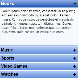
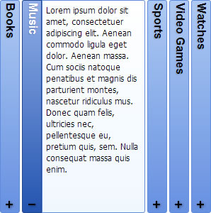
In general Accordion is a widget containing of groups with headers and content panels which expands its content vertically. IntegralUI Accordion extends this further allowing to horizontally expand the content of groups. In following section we will describe this feature in more details.
 Vertical Expansion |
 Horizontal Expansion |
a suite of UI Components for development of web apps
Horizontal Expansion
There are two ways to allow groups to expand its content horizontally, by setting the expandDirection to:
- right - group content expands from left to right
- left – group content is expanded from right to left
$(document).ready(function() {
// Create an instance of Accordion widget
var $bar = $('#accordion').accordion({
expandDirection: 'right',
hoverSelection: true
});
});
Using code above, the accordion will expands its content from left to right, when mouse cursor hovers over group header.
Related: Inline Expand in Accordion jQuery
By default the content of group headers, caption or custom content, is displayed horizontally. We can also show header displayed vertically while its content panel remains expanding horizontally. This is done by chaining the headerContentOrientation property:
- horizontal - group header displays its content horizontally
- vertical – group header displays its content vertically, a clockwise rotation of 90 degrees
// Create the content of group panel
var generateGroupContent = function(){
return "<div class='group-content marker-left'><a href=''>read more</a>Lorem ipsum dolor sit amet ... </div>";
}
Vertical Expansion
In vertical expansion, each group can expand its content either downwards or upwards. To enable this we are using the expandDirection property, with following values:
- down - group content expands downwards
- up – group content expands upwards
// Create an instance of Accordion widget
var $bar = $('#accordion').accordion({
expandDirection: 'up'
});
Using code above, the accordion will expands its content upwards whenever group header is clicked. Expanding while mouse cursor hovers over group header is disabled.
- animationSpeed – the speed of animation, default 500ms
- hoverSelection – group expands when mouse hovers over its header, default false
- showExpandBox – shows an expand box icon, default true
Here is a link to a demo which shows Changing of Expand Direction in Accordion jQuery.