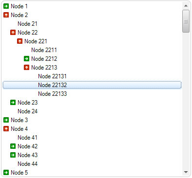
Show Different Image on Expand in TreeView
Created: 12 August 2013
Updated: 06 September 2013
By default nodes in TreeView are displayed without any icon and the visual representation of whether a node is expanded or collapsed is shown by using the plus/minus sign. When Windows Vista and later Windows 7 was released, the standard appearance of expand buttons has changed, and a new look with a right and right-down arrow was introduced.
Show Different Icon Whenever Node Expand or Collapse
In order to change the node icon when it is expanded or collapsed, we can handle the AfterExpand and AfterCollapsed events. By handling the AfterExpand event we can show an image which represents an open folder for example, and whenever node collapses in similar way we can use an image which represents a closed folder.
We can either use the ImageIndex or Image property to add an icon to a node. The Image property accepts any image in any size from a file or a resource. And the Image Index property specifies the index of the image that is contained inside TreeView.ImageList collection. When we have values in both of these properties, the Image property has a priority over ImageIndex, and it is first used to check whether it has some value.
private void treeView1_AfterExpand(object sender, LidorSystems.IntegralUI.ObjectEventArgs e)
{
// Change the icon of the node to show opened folder after node gets expanded
if (e.Object is LidorSystems.IntegralUI.Lists.TreeNode)
{
LidorSystems.IntegralUI.Lists.TreeNode node = (LidorSystems.IntegralUI.Lists.TreeNode)e.Object;
node.ImageIndex = 1;
node.SelectedImageIndex = 1;
}
}
private void treeView1_AfterCollapse(object sender, LidorSystems.IntegralUI.ObjectEventArgs e)
{
// Change the icon of the node to show closed folder after node gets expanded
if (e.Object is LidorSystems.IntegralUI.Lists.TreeNode)
{
LidorSystems.IntegralUI.Lists.TreeNode node = (LidorSystems.IntegralUI.Lists.TreeNode)e.Object;
node.ImageIndex = 0;
node.SelectedImageIndex = 0;
}
}
Private Sub treeView1_AfterExpand(ByVal sender As Object, ByVal e As LidorSystems.IntegralUI.ObjectEventArgs) Handles treeView1.AfterExpand
' Change the icon of the node to show opened folder after node gets expanded
If TypeOf e.[Object] Is LidorSystems.IntegralUI.Lists.TreeNode Then
Dim node As LidorSystems.IntegralUI.Lists.TreeNode = DirectCast(e.[Object], LidorSystems.IntegralUI.Lists.TreeNode)
node.ImageIndex = 1
node.SelectedImageIndex = 1
End If
End Sub
Private Sub treeView1_AfterCollapse(ByVal sender As Object, ByVal e As LidorSystems.IntegralUI.ObjectEventArgs) Handles treeView1.AfterCollapse
' Change the icon of the node to show closed folder after node gets expanded
If TypeOf e.[Object] Is LidorSystems.IntegralUI.Lists.TreeNode Then
Dim node As LidorSystems.IntegralUI.Lists.TreeNode = DirectCast(e.[Object], LidorSystems.IntegralUI.Lists.TreeNode)
node.ImageIndex = 0
node.SelectedImageIndex = 0
End If
End Sub
Change Image of Expand Button
There are some cases where we want to customize the appearance of expand button and show different image. In order to change the image of expand button we will use image properties from ExpandBoxStyle, and add our own custom made images for expanded and collapsed state.

this.treeView1.ExpandBoxStyle.ExpandImage = Image.FromFile("../../../Demo/expand.gif");
this.treeView1.ExpandBoxStyle.CollapseImage = Image.FromFile("../../../Demo/collapse.gif");
Me.treeView1.ExpandBoxStyle.ExpandImage = Image.FromFile("../../../Demo/expand.gif")
Me.treeView1.ExpandBoxStyle.CollapseImage = Image.FromFile("../../../Demo/collapse.gif")
In our example we have created a different image for expanded and collapsed states of expand button. There is no limitation of image size, if the image height is greater than node text, the node will automatically be resized and the text by default will be vertically centered.
You can download a sample project for .NET WinForms from here: Show Different Image On Expand