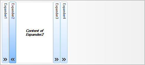
Expander .NET with Vertical Header and Content that Expands Horizontally
Created: 07 October 2014
The Expander .NET control consists of a header and a content panel. The header is usually placed at the top of content panel and by default its content is displayed horizontally. There is an option to change the orientation of its header and set in to appear vertically while expanding its content horizontally from left to right. In this article we will show you how to create a list of expanders which have vertical orientation with horizontal expansion of their content.
At first we will need Panel control in which we will place our Expander controls. Place a Panel control from the Visual Studio Toolbox on the Form and then place one Expander control in the panel. Because we want to create an expander that will expands horizontally, we need to set its Orientation property to Horizontal. This will change its layout so now its header is placed vertically on the left side, while its content panel is placed on the right side.
Now when we have an Expander with vertical header, we can add some content to its content panel. To simplify our example we will use only a Label control with some short text in it. To make sure that our expander is properly aligned in parent panel, we need to set its Dock property to Left. From proeprties window in Visyual Studio Designer, locate the Dock property and change its value to Left. This will enable changes to the panel height to also change the size of inside expander.
So far we have create a panel with expander in it, however this is not yet very usefull. To create a list of expanders, we need to add few more expander controls. To do that is simple, just copy/paste the first expander and add few more in panel. As a result we will have a list of expander controls all docked to the left side and all woth vertical header.
By clicking on expander header, the expander will expand or collapse its content horizontally, by doing so will move the position of subsequent expanders in the list. However, a single click on expander header will only work if its has the input focus. To solve this we will add a custom expand button, which whenever is clicked, it will expand or collapse the expander content panel.
To create a custom button in expander header is simple. From Visual Studio Designer select the Expander control, and in properties window locate the HeaderButtons property. This property is a collection whicl holds all buttons present in expander header. In our exampel we will add only one button. As visual representation of our button we will use an ImageList, which is applied to the ImageList property of Expander control.
In case when we have multiple buttons present in expander header, we also need a way to distiguish which button is clicked. In our case this will not be a problem, because we only have one button. But, in general it is a good practice to add a unique key for each button. This can be done from HeaderButtons collection editor window, where we can set the Key property to some unique value. In our case we will use the ‘TOGGLE’ string.
Because all our expanders will have the same button, we can repeat the process to add it using their own HeaderButtons collection property.
private void Expander_ButtonClicked(object sender, LidorSystems.IntegralUI.ObjectClickEventArgs e)
{
// Use the unique key applied to each button to determine which one is clicked
if (e.Key == "TOGGLE")
{
// Retrieve a reference to the parent Expander control
LidorSystems.IntegralUI.Containers.Expander ctrlExpander = (LidorSystems.IntegralUI.Containers.Expander)sender;
// Change the state of expander from expanded to collapsed, or vice versa
ctrlExpander.Expanded = !ctrlExpander.Expanded;
// Also change the appearance of clicked button to accomodate the Expander state
ctrlExpander.HeaderButtons[0].ImageIndex = ctrlExpander.Expanded ? 1 : 0;
}
}
Private Sub Expander_ButtonClicked(ByVal sender As Object, ByVal e As LidorSystems.IntegralUI.ObjectClickEventArgs) Handles Expander1.ButtonClicked, expander2.ButtonClicked, expander3.ButtonClicked, expander4.ButtonClicked
' Use the unique key applied to each button to determine which one is clicked
If e.Key = "TOGGLE" Then
' Retrieve a reference to the parent Expander control
Dim ctrlExpander As LidorSystems.IntegralUI.Containers.Expander = DirectCast(sender, LidorSystems.IntegralUI.Containers.Expander)
' Change the state of expander from expanded to collapsed, or vice versa
ctrlExpander.Expanded = Not ctrlExpander.Expanded
' Also change the appearance of clicked button to accomodate the Expander state
Dim imgIndex = 0
If ctrlExpander.Expanded Then
imgIndex = 1
End If
ctrlExpander.HeaderButtons(0).ImageIndex = imgIndex
End If
End Sub
At end, the clicks on this button will not work unless we handle the ButtonClicked event. In our handler we will use the unique key to determine which button was clicked and add some specific action. In this case that would be to change the state of expander from expanded to collapsed and vice versa, and also change the appearance of our button depending on this state. Apply this handler function to all existing expander controls in panel.
By default the panel will don’t allow appearance of scrollbar when size of contained expander controls is gerater the the size of panel. To allow this, select the panel and from properties window locate the AutoScroll property and change its value to true.
As a final result we have created a list of expander controls with vertical headers which expands or collapse their content panels horizontally from left to right.
A complete sample project in C# and VB which demonstrates this is available here: Expander .NET with Vertical Header
